Power BI is one of the most widely used tools for reporting and data analysis today.
From analysts to senior managers, many roles now expect you to know how to clean data, create reports, and build dashboards in Power BI. That’s why interviewers often test not just your knowledge of the tool, but also how you apply it to real business problems.
This article pulls together 70+ Power BI interview questions with clear, straightforward answers. It covers basics for freshers, advanced DAX and modelling concepts for experienced professionals, and a few scenario-based questions that reflect real projects.
Use it to review before your next interview or to brush up on areas you may not use every day.
Here’s a quick table of contents so you can jump straight to the section you need:
🔽 Table of Contents
- Basic Power BI Interview Questions
- Data Modelling and DAX Interview Questions
- Visualisation and Dashboard Interview Questions
- Advanced Power BI Interview Questions
- Scenario-Based Power BI Interview Questions
- Checklist: Quick Prep Before Your Power BI Interview
- Comparison Table: Power BI vs Tableau vs Excel
- FAQs on Power BI Interviews
Related: How to Create a Power BI Portfolio to Get Hired in 2026
Basic Power BI Interview Questions
Q1. What is Power BI?
Power BI is Microsoft’s business intelligence tool used for data analysis, visualisation, and reporting. It allows users to connect to multiple data sources, transform raw data into models, and build interactive dashboards that support decision-making.
Q2. What are the main components of Power BI?
The main components are:
- Power BI Desktop: For creating reports and data models.
- Power BI Service: Cloud platform to share and collaborate.
- Power BI Mobile: App for on-the-go access.
- Power BI Gateway: Connects on-premise data with cloud service.
- Power BI Report Server: Hosts reports on-premises.
Q3. What is DAX in Power BI?
DAX (Data Analysis Expressions) is a formula language used in Power BI for calculations, measures, and custom columns. Example:
Total Sales = SUM(Sales[SalesAmount])
Pro Tip: Interviewers often ask you to write simple DAX measures during live interviews, so practise common functions like SUMX, CALCULATE, and FILTER.
Q4. What is the difference between Power BI Desktop and Power BI Service?
Power BI Desktop is used for creating reports and visualisations locally. Power BI Service is the online cloud platform for sharing, collaboration, and scheduled data refresh.
Q5. What are Filters in Power BI?
Filters refine data shown in reports. Types include Visual-level filters, Page-level filters, Report-level filters, and Drillthrough filters.
Q6. What are Power BI Visualisations?
Visualisations are graphical representations of data like bar charts, pie charts, line graphs, maps, and custom visuals from the marketplace. They make insights easy to understand.
Q7. What are the different types of refresh in Power BI?
Power BI supports four refresh types:
- Package Refresh
- Model/Data Refresh
- Tile Refresh
- Visual Container Refresh
Q8. What data sources can Power BI connect to?
Power BI connects to Excel, CSV, SQL Server, Azure services, SharePoint, SAP HANA, Oracle, Salesforce, Google Analytics, and many other cloud and on-premise sources.
Q9. What is the difference between Import Mode and DirectQuery Mode?
Import Mode: Data is imported into Power BI, enabling fast queries but with refresh limits.
DirectQuery Mode: Queries are sent directly to the data source in real time, useful for large datasets but slower performance.
| Feature | Import Mode | DirectQuery Mode |
|---|---|---|
| Performance | Faster | Slower |
| Data Size | Limited | Unlimited (depends on source) |
| Refresh | Scheduled | Real-time |
Q10. What is the difference between Calculated Columns and Measures?
Calculated Columns: Created at row-level, stored in the model, increase file size.
Measures: Calculated at query time, lightweight, best for aggregations.
Related: Data Analyst Interview Questions and Answers
Data Modelling and DAX Interview Questions
Q11. What is data modelling in Power BI?
Data modelling in Power BI is the process of structuring data into well-designed tables and defining relationships between them. A good Power BI data model typically follows a star schema with fact and dimension tables. This ensures reports load faster, calculations using DAX functions are simpler, and dashboards remain scalable. Example: Building a Sales model with a FactSales table linked to Product, Customer, and Date dimensions.
Q12. What are relationships in Power BI?
Relationships define how tables are connected in a Power BI model. Types include one-to-many, one-to-one, and many-to-many. They control how filters flow across tables. Example: Linking a Customer table (one side) with an Orders table (many side) to ensure only relevant orders display when a customer is selected.
Q13. What is the difference between Star Schema and Snowflake Schema in Power BI?
Star Schema: Dimension tables connect directly to a central fact table. It is simple, improves Power BI performance, and makes DAX calculations easier.
Snowflake Schema: Dimension tables are normalised into multiple related tables. It saves storage but can slow queries and complicate relationships. Most Power BI experts recommend star schema for faster business intelligence reporting.
Q14. What is the difference between calculated columns and measures in Power BI data modelling?
Calculated Columns are evaluated row by row and stored in the model, increasing file size. They are useful when you need fixed values like "Profit = Sales – Cost".
Measures are computed at query time using DAX. They are lightweight and ideal for aggregations like Total Revenue or Year-to-Date Sales. For interview answers, highlight that measures are preferred for performance-optimised dashboards.
Q15. What are hierarchies in Power BI?
Hierarchies in Power BI are structured levels that allow drill-down analysis. Example: Date hierarchy (Year → Quarter → Month → Day) or Geography hierarchy (Country → State → City). They improve user experience in dashboards by enabling interactive exploration of data.
Q16. What is Row-Level Security (RLS) in Power BI?
Row-Level Security (RLS) restricts access to specific rows of data based on user roles. It is implemented using DAX filters. Example: A regional sales manager only sees their region’s sales, while other data is hidden. RLS is a common Power BI interview question as it demonstrates both technical and business security awareness.
Q17. What is the difference between SUM, SUMX, and CALCULATE in DAX?
SUM(): Adds up all values in a column.
SUMX(): Iterates row by row, applying an expression before summing.
CALCULATE(): Modifies the filter context and then evaluates the expression. Example: CALCULATE(SUM(Sales[Amount]), YEAR(Sales[Date])=2024). These DAX functions are frequently tested in Power BI DAX interview questions.
Q18. What is context in DAX (row context vs filter context)?
Row context means a calculation applies to the current row of a table (used in calculated columns). Filter context comes from slicers, visuals, or functions like CALCULATE. For interviews, explain how combining row and filter context is key to writing advanced DAX expressions.
Q19. What are Quick Measures in Power BI?
Quick Measures are built-in templates that generate DAX formulas automatically. Examples include running totals, year-to-date values, and percentage of grand total. They help beginners and non-technical users create Power BI reports without manually coding DAX.
Q20. What is the difference between ALL() and ALLEXCEPT() in DAX?
ALL() removes all filters from a table or column, often used to calculate grand totals.
ALLEXCEPT() removes all filters except the specified columns, allowing calculations like “% of sales by region.” These are frequently asked in advanced Power BI DAX interviews.
Q21. How do you handle many-to-many relationships in Power BI?
Many-to-many relationships in Power BI can cause duplicate values and ambiguous calculations. The recommended approach is to create a bridge table or use composite models. Example: A product sold in multiple categories can be resolved through a CategoryBridge table. This is a critical Power BI data modelling interview question.
Q22. What are calculated tables in Power BI?
Calculated tables are tables created with DAX instead of importing from a source. Example: Sales_2024 = FILTER(Sales, Sales[Year]=2024). They are often used for segmentation, scenario testing, or to simplify Power BI models for reporting.
Q23. What is the difference between RELATED and RELATEDTABLE functions in DAX?
RELATED() fetches a single related value from another table (e.g., fetching Customer Name for each Order).
RELATEDTABLE() returns all related rows (e.g., getting all Orders linked to one Customer). These functions are central to relational DAX interview questions.
Q24. What are KPIs in Power BI?
KPIs (Key Performance Indicators) in Power BI are visuals that show progress against a business target. Example: Sales vs Target, Gross Profit %, or Customer Satisfaction Score. They are widely used in Power BI dashboards to present business performance clearly.
Q25. What is the difference between calculated columns, calculated tables, and measures?
Calculated Columns: Row-based, stored in the model, increase size.
Calculated Tables: New tables created using DAX, useful for segmentation.
Measures: On-demand calculations, lightweight, best for aggregations. Explaining this difference shows strong knowledge of Power BI data modelling best practices.
Related: Skills and Best Practices to Become a Great Data Analyst
Visualisation and Dashboard Interview Questions
Q26. What are Power BI visualisations?
Power BI visualisations are graphical representations of data such as bar charts, pie charts, line graphs, maps, KPIs, and tables. They transform raw data into insights that are easy to interpret.
Example: A bar chart comparing monthly revenue across regions.
Q27. What is the difference between slicers and filters in Power BI?
Slicers are on-screen visuals that allow users to interactively filter reports. Filters are applied in the backend at visual, page, or report level.
Example: A slicer for selecting “Region” vs a report-level filter limiting data to the last 12 months. Both are essential for Power BI dashboard interactivity.
Q28. What are custom visuals in Power BI?
Custom visuals are third-party visualisations created by developers and available in the Microsoft AppSource marketplace.
Example: Funnel charts, word clouds, or heatmaps. They extend the standard set of Power BI visualisation options and are often tested in interviews for reporting roles.
Q29. What is a dashboard in Power BI?
A Power BI dashboard is a single-page canvas that brings together multiple visuals from different reports. Dashboards are interactive, real-time, and commonly used for executive summaries.
Example: A CEO dashboard showing Sales, Profit Margin, and Customer Growth KPIs.
Q30. What is the difference between a Power BI dashboard and a Power BI report?
Report: Multi-page, allows detailed exploration and drill-down.
Dashboard: Single-page, aggregates key visuals for quick monitoring.
Example: A report may show sales by region and product, while the dashboard summarises total revenue vs targets in one view.
Q31. What is a KPI visual in Power BI?
KPI visuals track progress against a set goal.
Example: A KPI showing “Sales: 80% of Target.” They are widely used in Power BI dashboards for management reporting.
Q32. What are drill-through filters in Power BI?
Drill-through allows users to right-click a data point and navigate to a detailed report page filtered by that value.
Example: Clicking on “Region: Asia” in a dashboard and being redirected to a detailed sales report for Asia only. This improves Power BI user experience.
Q33. What are bookmarks in Power BI?
Bookmarks capture the current state of a report page, including filters, slicers, and visuals. They allow easy navigation and storytelling.
Example: Creating a bookmark to present “Q1 Performance” vs “Q2 Performance” in a business review meeting.
Q34. What is conditional formatting in Power BI visuals?
Conditional formatting highlights values with colour coding or icons.
Example: Profit margins below 20% appear red, while above 40% appear green. This makes Power BI visualisations more insightful for business users.
Q35. What is the difference between tables and matrix visuals in Power BI?
Table Visual: Displays raw data row by row.
Matrix Visual: Adds pivot-style grouping and summarisation.
Example: A sales table shows each transaction, while a matrix summarises sales by Region and Product.
Q36. What are Power BI themes?
Themes define colours, fonts, and visual styles in Power BI reports. They ensure consistency with company branding.
Example: Using a corporate theme so all dashboards align with brand colours. Themes are often mentioned in Power BI interview questions for reporting.
Q37. What is a tooltip in Power BI?
Tooltips show extra details when users hover over a visual. Example: Hovering on a bar chart of revenue reveals Profit Margin and Units Sold. Tooltips improve Power BI dashboard usability.
Q38. What are Q&A visuals in Power BI?
Q&A visuals allow users to type natural language queries and instantly see results. Example: Typing “show total sales by region in 2024” generates a chart automatically. This feature showcases Power BI’s AI capabilities and is common in interviews for advanced BI roles.
Q39. What are performance tips for optimising Power BI dashboards?
Best practices include using star schema models, preferring measures over calculated columns, limiting visuals per page, and enabling query reduction features.
Example: Replacing 20 small visuals with summary KPIs improves load time dramatically.
Q40. What is the difference between live connection and import mode for dashboards?
Import Mode: Data is loaded into Power BI, faster queries but requires refresh.
Live Connection: Connects directly to data source (e.g., SQL Server Analysis Services), always up to date but depends on source performance. This is a common Power BI interview question for experienced professionals.
Related: Business Analyst vs. Data Analyst: Choosing the Right Path
Advanced Power BI Interview Questions
Q41. What is a Composite Model in Power BI?
A Composite Model in Power BI allows you to combine multiple data connectivity modes within a single model. For example, you can keep large fact tables in DirectQuery mode (for real-time queries) while using Import mode for smaller dimension tables. This balances performance and scalability.
Example: A retail dashboard can use live SQL data for daily sales and cached import data for product categories.
Q42. How do you optimise performance in large Power BI datasets?
Performance tuning in Power BI involves model design and query optimisation. Key practices include:
• Use a Star Schema with clean fact and dimension separation.
• Remove unnecessary columns and rows to reduce model size.
• Use Aggregation tables for summarised queries.
• Replace calculated columns with measures where possible.
• Monitor performance using DAX Studio and the Performance Analyzer tool.
Example: Instead of storing a Year column, use a measure YEAR(Sales[OrderDate]) for on-demand calculation.
Q43. What are Aggregations in Power BI and when should you use them?
Aggregations are pre-calculated summaries of data stored at higher levels of granularity. They accelerate queries on large datasets. For instance, instead of querying a billion-row fact table, you can pre-aggregate data at Month or Region level. Power BI automatically redirects queries to the aggregated table when possible, drastically improving report speed.
Q44. How do you implement Incremental Refresh in Power BI?
Incremental Refresh loads only new or changed data instead of reloading the entire dataset. It is configured in Power Query by setting parameters for RangeStart and RangeEnd. Example: A sales dataset with 5 years of data can refresh only the latest 2 months daily, while older data remains static. This reduces refresh times and resource usage.
Q45. What are Calculation Groups in Power BI and why are they useful?
Calculation Groups simplify complex models by reusing common calculations across multiple measures. Instead of creating separate measures for Year-to-Date, Quarter-to-Date, or Month-to-Date, you can define a single calculation group in Tabular Editor. This reduces redundancy and improves maintainability in enterprise models.
Q46. How does Power BI handle large datasets with billions of rows?
Power BI handles big data through a mix of Import, DirectQuery, and Hybrid (Composite) models. For billions of rows, DirectQuery or Aggregations are preferred. Techniques like Incremental Refresh, Dataflows for pre-cleaning, and Azure Synapse integration help scale datasets efficiently.
Example: A telecom company analysing billions of call records uses DirectQuery linked to Synapse for live reporting.
Q47. What is Query Folding in Power Query?
Query Folding is the process where Power Query translates transformations into native SQL queries at the source, reducing memory load in Power BI.
For example, filtering rows in Power Query generates a WHERE clause in SQL.
Best practice: keep transformations that support query folding at the start of the query to maximise efficiency.
Q48. How do you manage Power BI workspace governance in large organisations?
Workspace governance involves managing access, roles, and security policies across Power BI environments. Common practices include:
• Assigning Admin, Member, Contributor, and Viewer roles appropriately.
• Using Sensitivity Labels for confidential data.
• Enforcing Row-Level Security at dataset level.
• Automating deployments using Deployment Pipelines.
Example: Finance reports are accessible only to Managers via RLS filters, while executives have full access.
Q49. What is Paginated Reporting and how is it different from Power BI Reports?
Paginated Reports in Power BI (built with Report Builder) are pixel-perfect, printable reports ideal for invoices, forms, and detailed records. Unlike interactive Power BI dashboards, they are designed for static, page-formatted outputs.
Example: A healthcare company generates monthly patient billing statements using Paginated Reports, while dashboards show operational KPIs.
Q50. How do you optimise DAX performance in complex calculations?
DAX performance tuning requires minimising row-by-row operations and leveraging context efficiently. Key tips:
• Use variables (VAR) to avoid recalculations.
• Replace FILTER inside iterators with CALCULATE where possible.
• Avoid using IF with row scans; use SWITCH for multiple conditions.
• Use SUMMARIZECOLUMNS instead of nested SUMMARIZE for better performance.
Example: Replace SUMX(FILTER(Sales, Sales[Region]="APAC"), Sales[Amount]) with CALCULATE(SUM(Sales[Amount]), Sales[Region]="APAC").
Q51. What are Deployment Pipelines in Power BI Service?
Deployment Pipelines enable version control and structured release management in Power BI Service. Workspaces are divided into Development, Test, and Production stages.
Developers publish changes in Dev, test them in Test, and push them to Production after approval.
This ensures governance and minimises risks in enterprise BI projects.
Q52. What is XMLA Endpoint and why is it important in Power BI Premium?
XMLA Endpoint allows external tools (like SQL Server Management Studio or Tabular Editor) to connect directly to Power BI datasets hosted in Premium capacity.
It enables advanced administration, scripted automation, and external query execution, making Power BI behave like an enterprise-grade Analysis Services model.
Q53. What are Dataflows in Power BI and how do they differ from datasets?
Dataflows are reusable ETL pipelines built in Power Query Online and stored in the cloud.
They allow multiple datasets to consume the same cleaned data source. Datasets, on the other hand, are the semantic models built on top of Dataflows or direct data imports.
Example: A central Dataflow cleans Customer Master data once, and multiple Sales/Marketing datasets use it.
Q54. How do you implement Row-Level Security with dynamic users in Power BI?
Dynamic Row-Level Security uses a mapping table with usernames or email IDs linked to allowed regions or departments. The DAX function USERNAME() or USERPRINCIPALNAME() retrieves the logged-in user, and a filter is applied accordingly.
Example: [Region] = LOOKUPVALUE(UserRegion[Region], UserRegion[Email], USERPRINCIPALNAME()) ensures users only see their own region’s data.
Q55. What are Best Practices for Advanced Power BI Modelling?
Key best practices for advanced Power BI modelling include:
• Use a Star Schema and avoid Snowflake where possible.
• Keep measures in a dedicated “Measures Table” for organisation.
• Use Calculation Groups for time intelligence.
• Apply Incremental Refresh and Aggregations for large models.
• Use descriptive naming conventions for tables and measures.
• Regularly document DAX logic for maintainability.
These practices ensure scalability, governance, and maintain high performance in enterprise BI solutions.
Related: Must-Have Skills for Data Engineers in 2026
Scenario-Based Power BI Interview Questions
Q51. You are asked to create a sales dashboard where managers should only see their region’s data. How would you design this in Power BI?
The best approach is to implement Row-Level Security (RLS).
Create roles in Power BI Desktop (e.g., Region = “North”) and assign them to managers in the Power BI Service.
When managers log in, they only see sales figures for their assigned region.
Q52. A report is running very slow because it loads large transactional data. How would you optimise the performance?
Optimisation techniques include:
– Import mode instead of DirectQuery where possible
– Aggregation tables for summary-level queries
– Using Star Schema instead of Snowflake
– Reducing high-cardinality columns
– Applying query folding in Power Query
Example: If a table has 50 million rows, pre-aggregate sales by month at the database layer instead of loading raw transactions.
Q53. If your DAX measure is giving incorrect results in a matrix visual, how would you debug it?
Debugging usually involves checking context transition.
Steps:
1. Validate relationships between tables.
2. Use VALUES() or SELECTEDVALUE() to check filter context.
3. Apply CALCULATE() with explicit filters to override context.
Practical Example: If Sales[Amount] SUM is wrong, wrap the measure in CALCULATE(SUM(Sales[Amount]), ALL(Dates)) to verify if date filter context is the cause.
Q54. Your manager asks for Year-to-Date (YTD) sales, but the fiscal year starts in April. How would you handle this?
Use a custom fiscal calendar. Create a Date table with FiscalYear and FiscalMonth columns. Then, use a DAX formula such as:
YTD Sales = TOTALYTD(SUM(Sales[Amount]), Dates[Date], "03-31")
This ensures calculations reset every April 1 instead of January 1.
Q55. If a client requests a dashboard refresh every 15 minutes but the source is SQL Server, how would you set it up?
You can achieve this by:
– Using DirectQuery mode instead of Import mode (real-time connection to SQL).
– Or scheduling refresh in the Power BI Service Gateway (though standard refresh limits are 8/day in Pro, 48/day in Premium).
DirectQuery is usually preferred for real-time needs, provided query performance is acceptable.
Q56. A report shows incorrect totals when using measures with AVERAGE. How would you fix this?
The problem comes from how averages are aggregated. Instead of AVERAGE(), create a measure with SUM() / COUNTROWS().
Example: Avg Sales per Customer = DIVIDE(SUM(Sales[Amount]), DISTINCTCOUNT(Sales[CustomerID])). This ensures correct totals at all levels of aggregation.
Q57. You have a many-to-many relationship between Products and Promotions. How do you model this?
The correct way is to introduce a bridge table (factless fact table).
Example:
– Products Table
– Promotions Table
– Bridge Table: ProductPromotion (ProductID, PromotionID) .
This keeps relationships clean and prevents incorrect aggregations in visuals.
Q58. Your report has sensitive data. How do you secure it beyond just RLS?
Security can be enhanced by:
– Using Object-Level Security (OLS) to restrict access to specific columns or tables.
– Masking PII data (e.g., showing partial customer numbers).
– Leveraging Azure Active Directory for authentication.
For example, OLS ensures a user can see overall sales but not Salary or Margin columns.
Q59. A stakeholder asks to see last year’s sales compared to current year in the same visual. How would you achieve this?
Use time intelligence functions like SAMEPERIODLASTYEAR().
Example DAX: Sales LY = CALCULATE(SUM(Sales[Amount]), SAMEPERIODLASTYEAR(Dates[Date])).
Then plot Sales vs Sales LY in a line chart for comparison across years.
Q60. Your report users complain about too many filters. How do you improve usability?
Instead of adding dozens of slicers, use:
– Hierarchical slicers (e.g., Country → State → City).
– Drill-through pages for detailed analysis.
– Bookmarks and buttons to create guided navigation.
This makes dashboards cleaner while still offering deep interactivity.
Q61. You are asked to build a KPI dashboard where executives only want a high-level summary. What’s your approach?
Use card visuals for KPIs like Total Sales, Profit %, Customer Churn, and combine them with sparklines or small multiples for trend visibility.
Avoid clutter — executives want insights, not raw data tables. Add drill-through pages if they need more context.
Q62. A client complains their Power BI mobile app shows distorted visuals. How do you fix it?
Optimise for Power BI Mobile Layout. Use the mobile view option in Power BI Desktop to rearrange visuals for smaller screens.
For example, stack KPIs vertically and use bar charts instead of wide tables to ensure readability on phones.
Q63. Your DAX calculation gives different results in visuals compared to Excel pivot tables. Why could this happen?
Power BI uses DAX with context, while Excel pivot tables work with cell-based calculations. Differences arise due to filter context and measure definitions.
For example, Excel may average raw rows, but Power BI averages at an aggregated context level, producing different results.
Q64. You are asked to integrate Power BI with SharePoint to display reports. How would you do it?
Embed the Power BI report using the Power BI web part in SharePoint Online.
Publish the report to Power BI Service → File → Embed in SharePoint → paste the link into the SharePoint site.
Ensure permissions are aligned (users must have report access in Power BI Service).
Q65. You need to share a dashboard externally with a client who doesn’t have Power BI Pro. What are your options?
Options include:
– Publish to Web (but data becomes public, risky for sensitive info).
– Power BI Premium capacity (lets external users view reports without Pro licenses).
– Export to PDF/PowerPoint if interactivity is not required.
Q66. How would you handle currency conversion in a multi-country sales report?
Maintain an exchange rate table with Date, Currency, and Conversion Rate.
Relate it to the Date table and use DAX: Sales in USD = SUMX(Sales, Sales[Amount] * RELATED(ExchangeRate[Rate])).
This ensures accurate conversion based on the transaction date.
Q67. A stakeholder asks for “What-If” analysis of pricing changes in Power BI. How would you set it up?
Use What-If Parameters in Power BI Desktop.
For example, create a Price Multiplier parameter ranging from 0.8 to 1.2. Link it to a measure: Adjusted Sales = SUM(Sales[Amount]) * SELECTEDVALUE(PriceMultiplier[Price Multiplier]).
Users can adjust a slider to simulate price changes instantly.
Q68. You need to compare actual vs target performance across multiple dimensions. How would you do it?
Use a Target table (Month, Product, TargetValue) linked to your Fact table.
Create a DAX measure: Variance = SUM(Sales[Amount]) - SUM(Targets[TargetValue]).
Then use combo charts (bar + line) or KPI visuals for a clear Actual vs Target comparison.
Q69. You’re tasked with designing a Power BI report for HR attrition analysis. What would you include?
Key inclusions:
– Employee Headcount trend
– Attrition % (leavers / avg employees)
– Department-wise attrition
– Tenure analysis (attrition by years of service)
– Drill-through to employee-level details.
This helps HR identify problem departments and retention issues quickly.
Q70. You are asked to migrate multiple Excel reports into a unified Power BI dashboard. How would you approach this?
Steps:
1. Consolidate Excel files into a structured folder.
2. Connect Power BI to the folder (Power Query auto-detects files).
3. Standardise column names and data types.
4. Build a Star Schema instead of flat Excel sheets.
5. Create centralised dashboards replacing redundant Excel reports. This reduces duplication and ensures a single source of truth.
Related: Big Data Interview Questions & Answers
Checklist: Quick Prep Before Your Power BI Interview
Power BI interviews go beyond technical syntax, they test your ability to apply concepts in real-world scenarios.
Use this quick checklist to make sure you’re fully prepared and confident before the interview day.
- Revise Core Concepts: Be clear on data modelling, relationships, star vs snowflake schema, DAX basics, and key Power BI components (Desktop, Service, Gateway, Report Server).
- Practice DAX Functions: Focus on SUMX, CALCULATE, FILTER, RELATED, and advanced time intelligence functions. Prepare 1–2 examples where you solved a reporting challenge using DAX.
- Brush Up on Power Query: Be ready to explain how you handled data cleaning, transformations, and applied M queries in real projects.
- Understand Context in DAX: Revise row context vs filter context with simple, clear examples you can confidently explain.
- Know Common Interview Scenarios: Be prepared for case-based questions like sales growth analysis, KPI dashboards, and handling large datasets with incremental refresh.
- Performance Tuning Tips: Recall strategies for optimizing models—such as aggregations, composite models, DirectQuery vs Import, and using variables in DAX for efficiency.
- Governance & Security: Revise Row-Level Security (RLS), workspace roles, and publishing best practices for enterprise reporting.
- End-to-End Project Walkthrough: Be ready with one structured project story where you explain the business need, data sources, modelling, DAX measures, and dashboard delivery.
- Communication Practice: Interviews value clarity—practice explaining technical answers in simple terms that a business stakeholder can understand.
- Mock Questions: Practice a mix of basic, advanced, and scenario-based Power BI interview questions so you’re not caught off guard.
This Power BI interview questions checklist helps you stay structured during preparation. Focus on explaining concepts with clarity, back them up with examples, and you’ll stand out in Power BI interviews compared to other candidates.
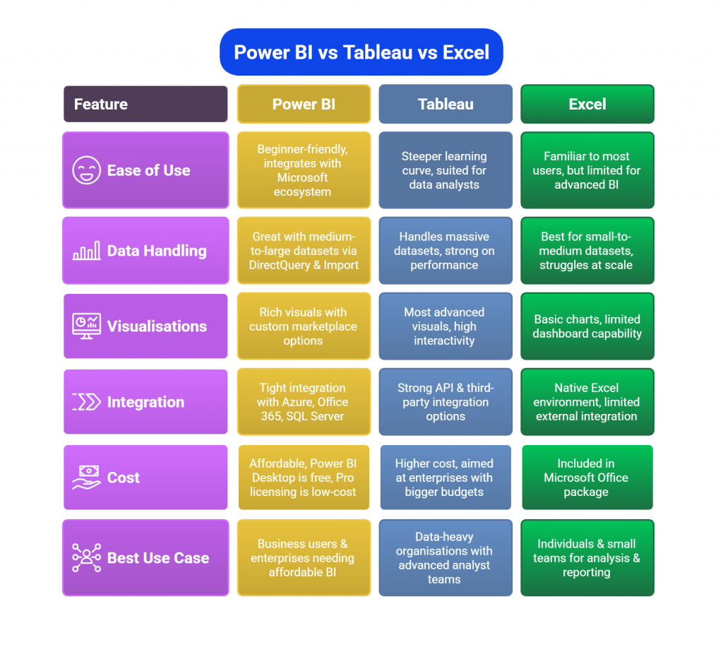
Comparison Table: Power BI vs Tableau vs Excel
Power BI, Tableau, and Excel are the three most commonly compared tools in business intelligence interviews. Recruiters often ask candidates to highlight their strengths, weaknesses, and best-use cases. Below is a clear comparison to help you frame confident answers.
| Feature | Power BI | Tableau | Excel |
|---|---|---|---|
| Ease of Use | Beginner-friendly, integrates with Microsoft ecosystem | Steeper learning curve, suited for data analysts | Familiar to most users, but limited for advanced BI |
| Data Handling | Great with medium-to-large datasets via DirectQuery & Import | Handles massive datasets, strong on performance | Best for small-to-medium datasets, struggles at scale |
| Visualisations | Rich visuals with custom marketplace options | Most advanced visuals, high interactivity | Basic charts, limited dashboard capability |
| Integration | Tight integration with Azure, Office 365, SQL Server | Strong API & third-party integration options | Native Excel environment, limited external integration |
| Cost | Affordable, Power BI Desktop is free, Pro licensing is low-cost | Higher cost, aimed at enterprises with bigger budgets | Included in Microsoft Office package |
| Best Use Case | Business users & enterprises needing affordable BI | Data-heavy organisations with advanced analyst teams | Individuals & small teams for analysis & reporting |
When asked in interviews, highlight that Power BI is cost-effective and easy to adopt for most companies, Tableau excels in advanced visualisation, and Excel remains essential for quick analysis but lacks enterprise BI power.